The Meaning Behind Inkspire360
The name Inkspire360 represents a fusion of creativity, strategy, and innovation.
"Ink'' symbolizes the power of storytelling, branding, and design—where ideas take shape and leave a lasting mark.
"Spire" reflects inspiration, growth, and reaching new creative heights.
"360" signifies a complete, holistic approach—offering end-to-end branding, design, and digital solutions.
At Inkspire360, we go beyond aesthetics to craft meaningful, impactful brand identities that inspire and engage.
Inkspire360 Colour Palette & Meaning
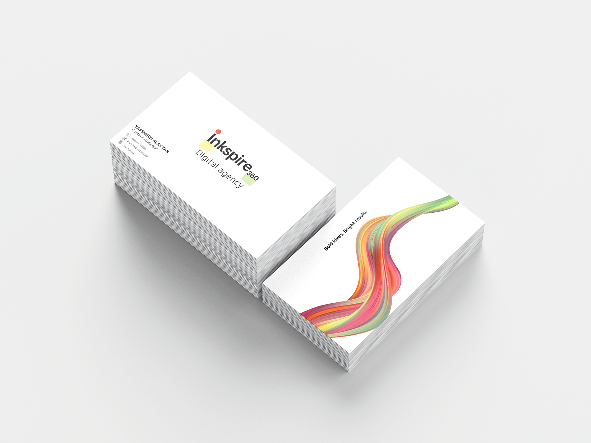
At Inkspire360, our brand colours are intentionally chosen to reflect creativity, innovation, and balance—core elements of our approach to branding and design.
Bold Red-Orange embodies passion, energy, and the drive for impactful storytelling. It represents the boldness and confidence we bring to every project.
Warm Yellow-Gold symbolizes inspiration, strategic thinking, and innovation. It highlights the bright ideas that fuel our creative process.
Soft Green conveys growth, harmony, and balance. It reflects our holistic approach, ensuring that every brand we craft is both visually compelling and strategically grounded.
This carefully curated palette defines Inkspire360’s identity, creating a visual language that is both dynamic and timeless.